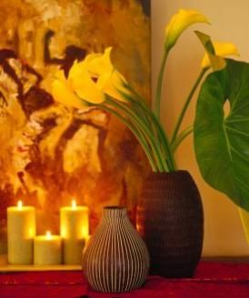
 “A classic vignette strategy is to mimic shapes or themes in subtle ways. The painting in this vignette echoes the buttery tones of the calla lilies. See more pictures of vignettes.Michael Grimm/Getty Images
When you hear the word "vignette," you may think of a short scene in a play or a quick character sketch. A design vignette isn’t too different from its theatrical and literary counterparts. After all, an effective vignette, or tablescape, has its own stage (in the form of a side table, mantle or dresser) and tells a story. Budget-friendly and able to deliver a high-impact visual with minimal effort, it’s one of the design world’s go-to tricks to lending some drama to a drab corner — whether that corner is in your living room or your child’s bedroom.
The beauty of creating a vignette is that it’s unique to you and what you want to express, and can be changed and rearranged whenever the mood strikes. Maybe you’ve been pondering what to do with your porcelain owl collection. Or you’ve been daydreaming about going to, say, Paris. Sacre bleu! You’ve just stumbled on your design inspiration. Now think about what you may have up in the attic or tucked away in a closet. An Edith Piaf record? Check. A replica of the Eiffel tower? Oui. A gold-framed mirror? Voilà! Suddenly, you’ve got the makings for a très chic vignette.
Now what? Like any improvisational great, before you start throwing together your items, you’ll need to apply a few key principles, like identifying objects to anchor your vignette, the scale of your objects and dominant colors, to name a few. Also, we’re going to have a heart to heart about those owls and collections in general. Don’t worry — we’ll be gentle — and you’ll soon be the proud artiste of your very own vignette.
Contents
- Assembling Vignette Items
- Anchor Objects
- The Rules of Scale and Shape
- To Theme or Not to Theme?
Assembling Vignette Items
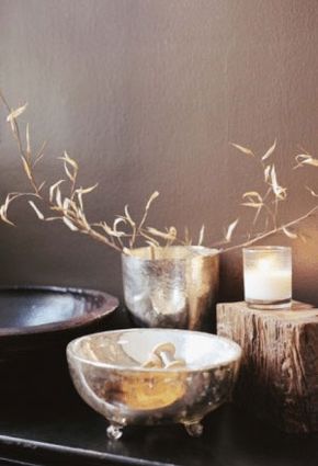
 “Perhaps you’d like to display a Zen-like vignette. Gather up wood and metal items and pair them with a candle and flowers.Melanie Acevedo/Getty Images
You don’t necessarily need to buy anything new in order to create a vignette — half of the fun is rummaging around to see what you can unearth. If you’re in the mood to create something Zen-like, you could pluck the Buddha head from your bathroom counter and use it in a vignette you’re creating on a side table in your living room. The best way to figure out what you want to use and what you may need to buy is to assemble all of the objects in your house that you find interesting and then group them together by color or theme. See what jumps out at you and what you might be missing. You may notice that you have an assortment of objects in different shades of green that you’d like to display with a stack of brown leather-bound books. The key at this stage is to identify what you like and keep an eye out for "anchor objects."
Anchor Objects
In general, anchor objects tend to be the stand-out piece (or pieces) in a vignette. Usually larger in scale, typical anchor objects are lamps, paintings, photographs, mirrors, sculptures or objects like an old record player or flowers and plants. It’s usually the first thing your eye spies, and other than dictating the scale and relationship to the other objects, it sets the tone. Keep in mind that you can put just about anything in a vignette, and just because your1960s coral lamp is sitting pretty in your bedroom doesn’t mean it can’t play the star of your new living room vignette.
Anchors Away
Industrial items like anchors, old engineering parts or architectural castaways make perfect objects to serve as the base for your vignette.
The Rules of Scale and Shape
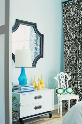
 “A successful vignette creates visual interest. The blue lamp anchors the scene and creates scale. The yellow vases follow the rule that odd-numbered items grouped together are more pleasing to the eye.Dominique Vorillon/Getty Images
Indulge us a moment and group together four objects. Now add a fifth. Looks better, huh? That’s not an accident. Objects assembled in odd numbers are more harmonious and pleasing to the eye. This is the first rule of a vignette: Make sure that you have an odd number of dominant objects. (Also, keep in mind that a stack of books, or any other uniform set of multiples, is considered one dominant object.)
Now look at your anchor object in relation to the rest of the items you’ve selected. Is there a balance in the relationship among your items? Here’s the second concrete rule for vignettes: If you have a sculpture that’s your anchor object and it’s measuring about 2 feet in height, pair it with an item or items that are half the size of the sculpture. Let’s say you’ve identified a 1-foot-high candle as the anchor. Now find another item or items that are roughly half the size of the candle. The concept we’re talking about here has to do with the golden ratio, basically finding symmetry in the relationship of lines to one another. The point is that you don’t want a huge object sitting next to teensy-weensy ones, with no height differentiation in between.
And the third concrete rule for your vignette follows similar principles of scale: Look for variety in shapes. Your tablescape can skew more toward the rectangular in shape, if that’s what you’re after, but there should be a couple of other shapes interspersed to break up the visual field.
Now, about that owl collection…
To Theme or Not to Theme?
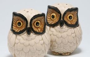
 “If you have a collection, display one or two items with complimentary objects. This ensures that you don’t inadvertently create an "Owl Corner" in your living room.©iStockphoto.com/Marcelo Saavedra
Some of the most striking vignettes have very subtle themes running through them. It could be as simple as orange, pink and black showing up here and there in a painting or book cover. Others are more obvious, like an assortment of objects representing the elements (wood, metal, a fountain, for example). There are no hard-and-fast rules when putting an assortment of objects together. The operative word here is "assortment." That means that collections, like a prized porcelain owl collection, shouldn’t be displayed together. Don’t get us wrong — we love owls! But if you want to show them off, you’re better off selecting one or two of them. So, go easy; otherwise, your vignette might evoke the taxidermied lobby of the Bates Motel. Which is fine, if you’re intentionally creating an Alfred Hitchcock vignette, and even then you’ll need to mix your owls with a with a couple retro matchbooks, a pair of dainty gloves, a stage knife and an old suitcase. Hmm, we think we may just have this year’s Halloween vignette in the making…
Lots More Information
Related Articles
- Scavenger Hunt: Finding the Right Accessories that Reflect the Real You
- Top 10 Must-have Home Accessories
- Top 5 Ways to Add Value to Your Home
- Furnishing for Comfort and Style


